Easy to Understand Bell Curve Chart
The Bell Curve has been around for years.But explaining to someone who isn't familiar with it or slept through college math can be confusing...
SEE ALSO: Crush Therapy Goals with the All in One Printable Flashcards
Our site focuses on providing simplified information while doing our best to remain professional and informative.
I've attended a lot of meetings in during my career, many of which I could have benefited from a more graphic version of the bell curve.
After some research, I have come to find that this type of version is very closely related to a jack-a-lope, snipe, and unicorn...it simply doesn't exist.
SEE ALSO: The Best Free App for Speech Therapy
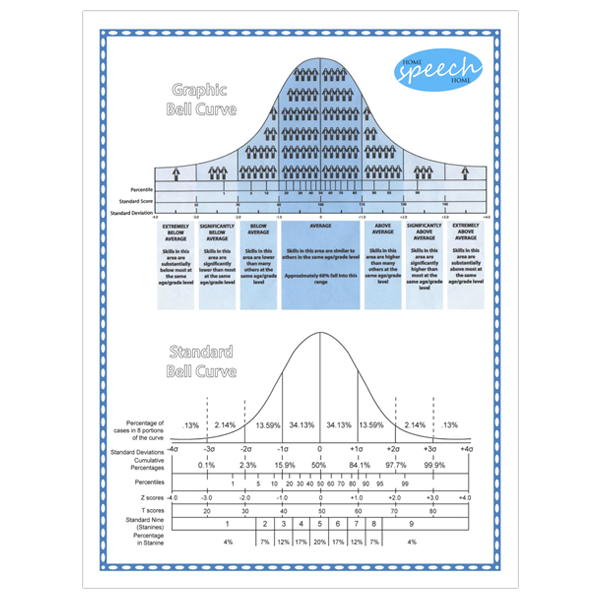
In September 2013, I came across a bell curve chart that provides a really nice and simple visual representation. It was perfect for explaining test scores to individuals that were unfamiliar with normal distribution.
Unfortunately, the simplified chart didn't have the statistical information on it that professionals needed.
So, I combined the two together and TA-DA!
Be sure you have the latest version of Adobe Reader (be sure to uncheck the "Optional Offer box" otherwise it will install McAfee Security Scan).
As always, if you'd like to share this with someone you know. Please use the share buttons on this page.
*Special thanks to Louise Valente from Pacific Coast Speech for the upper portion of this chart.
If you want to work for a private practice that serves schools in the Southern California area, they have great opportunities available. Contact Pacific Coast Speech
Click the Image Below to Download
Your Free Copy of the Bell Curve Chart
Special Deals and Activities, Oh My!
Sign up for Terrific Therapy Emails
Your information is 100% private & never shared.
